
Published on
Recognizing the need for a visual overhaul
Over the past five years, we've rapidly expanded our product suite with new features and functionality, prioritizing client feedback to improve the Addepar experience. Numerous feedback sessions revealed that our clients felt our visual design needed an update. They often described that our UI did not meet their expectations, and in some cases, noted that our color choices clashed with their own firm branding.
We also faced consistency issues in our visual design. Our platform encompasses various products, some built years ago and unchanged since release, while others — either acquired or recently developed — sport a more modern look. While this disparity didn't significantly impact users of a single product, those familiar with multiple Addepar products experienced a jarring disconnect when navigating between different UIs.
Fundamentally, we lacked a cohesive visual signature—a distinctive look and feel that inspires confidence in Addepar, the premier tech and data platform for investment professionals. As our platform grows and caters to diverse user personas — from traders to data analysts to wealth advisors — it's crucial that our visual design evolves. We strive to offer a modern, high-performance aesthetic that inspires security and confidence in all our users.
Old Addepar UI
Building confidence through user research
There were an infinite number of visual directions in which we could develop, but whatever we created had to fit the needs of our users, not our own preferences. Knowing this, we initiated a research effort to identify what would resonate with our very specific user audiences of advisors, traders and other wealth professionals. This way, we weren’t designing for us, and what we thought would look best. Instead, we could gather insights directly from our users and deliver what "great" means to them. If anyone internally had a differing subjective opinion — which is inevitable with visual design — we could refer back to our user research and demonstrate that all our design decisions were backed by data. You can’t argue with data!
We began our research by conducting a survey to gain deeper insights into the preferences and expectations of financial professionals, both Addepar users and non-users. Our goal was to understand their expectations for platforms like ours, as well as their visual preferences and what they value most in technology products.
Our User Research team created a set of positive attributes commonly associated with successful technology brands. These attributes were organized into five key themes: Performance, Ease of Use, Trust and Confidence, Look and Feel, and Innovation. Under the Performance theme, we examined attributes such as “Efficient” and “Robust,” whereas, for Ease of Use, we included attributes such as “Clean,” “Friendly,” and “Smart.” By categorizing these attributes into these five distinct themes, we were able to effectively analyze the preferences of different user groups and identify the specific qualities they value most in financial technology products.
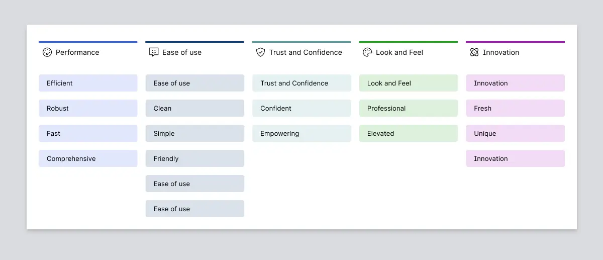
Attributes by theme
In the first part of the survey, we asked the participants to associate these attributes with various concepts and ideas we presented. Based on this feedback, we were able to effectively identify the attributes that resonated most strongly with our users. This feedback led us to uncover key findings: that clients are seeking a platform that characterized performance and innovation, felt premium, and was still easy to use.
In the second part of the survey, we presented participants with a series of conceptual financial products, each with a distinct visual style. These designs ranged from traditional to avant-garde. To determine their preferences, we asked participants to rate each design using the same attributes we employed in the first part of the survey and then followed up with questions such as 'Which of these designs do you envision yourself using in your daily work?' and 'What influenced you to select these attributes?'
By focusing on how users perceived the designs' utility along with their personal aesthetic preferences, we were able to gain a deeper understanding of the emotional attributes they associate with effective financial products.
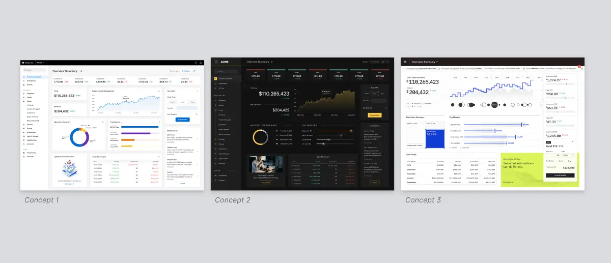
Conceptual financial products
This approach allowed us to gain a comprehensive understanding of users' emotional needs and the visual elements that they believe would enhance their productivity and efficiency. The results were empowering – the insight into the users' psyche and understanding exactly what they wanted. With these findings, we created more realistic and effective designs that truly resonated with our clients.
In the second phase of our research, we created a new set of designs carefully tailored to address the feedback gathered from the initial survey. By testing these refined designs with our users, we identified areas where our initial assumptions were accurate and where we had missed the mark. While performance and innovation were confirmed as essential attributes, we learned that striking the right balance between these elements and maintaining a professional aesthetic is crucial. A financial technology platform must exude a state-of-the-art look and feel, but it should avoid excessive flashiness or futuristic elements that might resemble a video game. The visual language that resonates well with consumer investing platforms is perceived as off-putting or even childish by wealth management professionals, who rely on these tools daily to build trust and steward their clients.
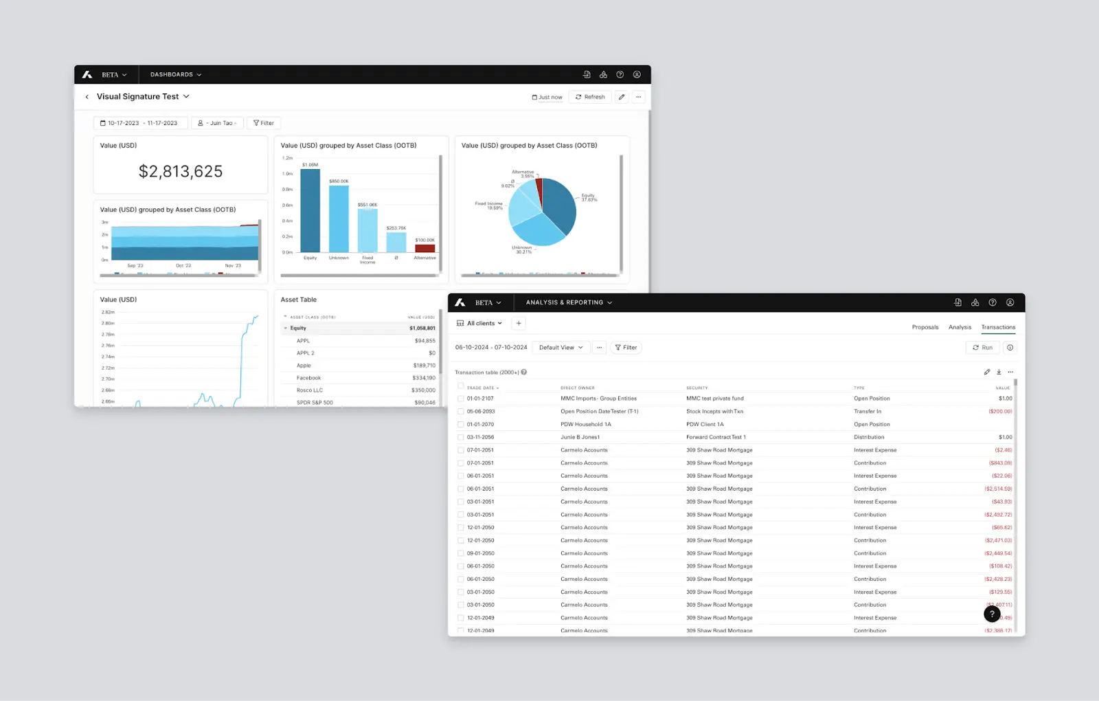
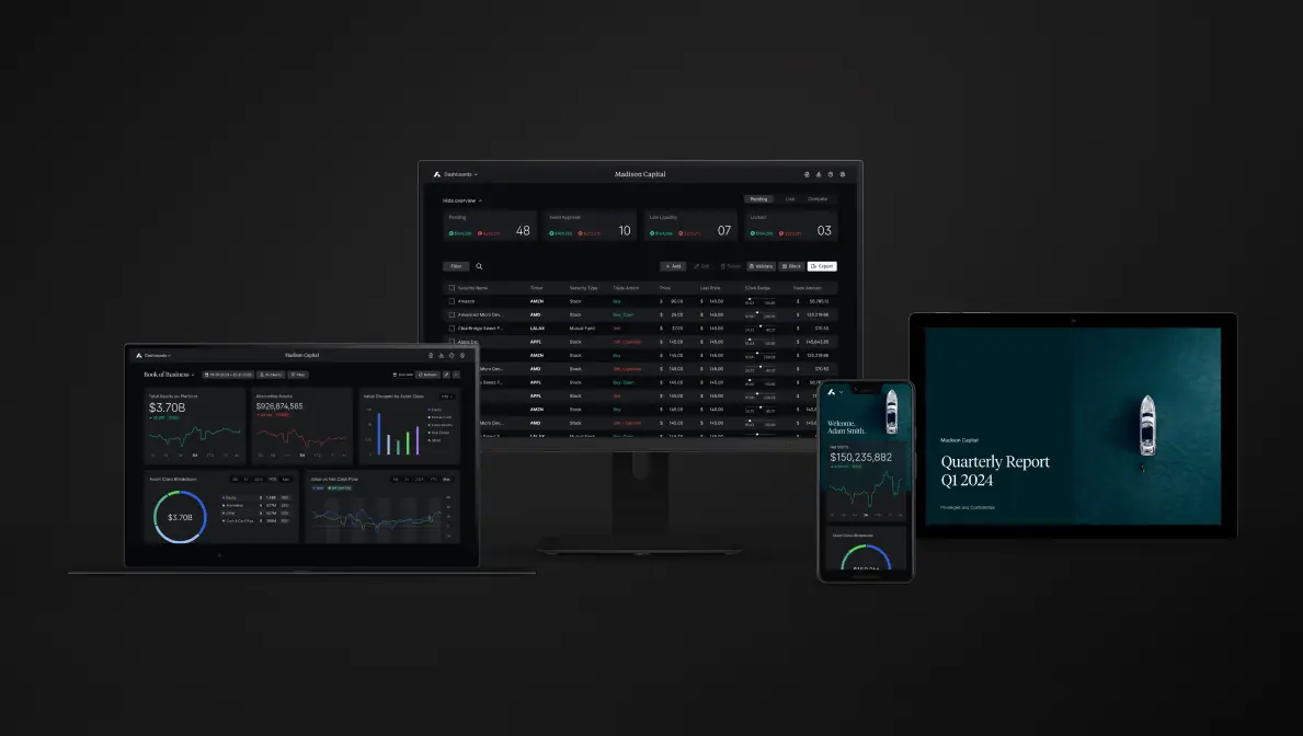
Addepar’s new visual signature
We landed on a version that kept what works and is familiar for our users, but was a complete aesthetic transformation. We used shades of gray to create depth on every page, creating a more premium and immersive experience for our users. Our revamped charting library now exudes performance, positioning us as innovators in the wealth management industry. Each Addepar product will now feel modern, fresh and consistent when integrated across the entire platform.
Addepar’s new visual signature
Finalizing our new look and feel kickstarted an overhaul of our design system. This included font and color enhancements, a comprehensive elevation system, and the use of Figma's variables feature to define color tokens.
Font enhancements
In the new design system, we chose to switch from Tiempos Headline Regular to Tiempos Headline Light for our display font to provide a more mature, editorial feel, complementing the premium aesthetic we aimed to achieve.
We also updated the various OpenType settings for Inter, our body font, to better align with our visual signature aesthetics and lend a more technical feel. If you look closely at the before-and-after image below, you'll notice adjustments made to the tracking and the appearance of specific glyphs (e.g., capital I, capital G, 1, 3 and 4).
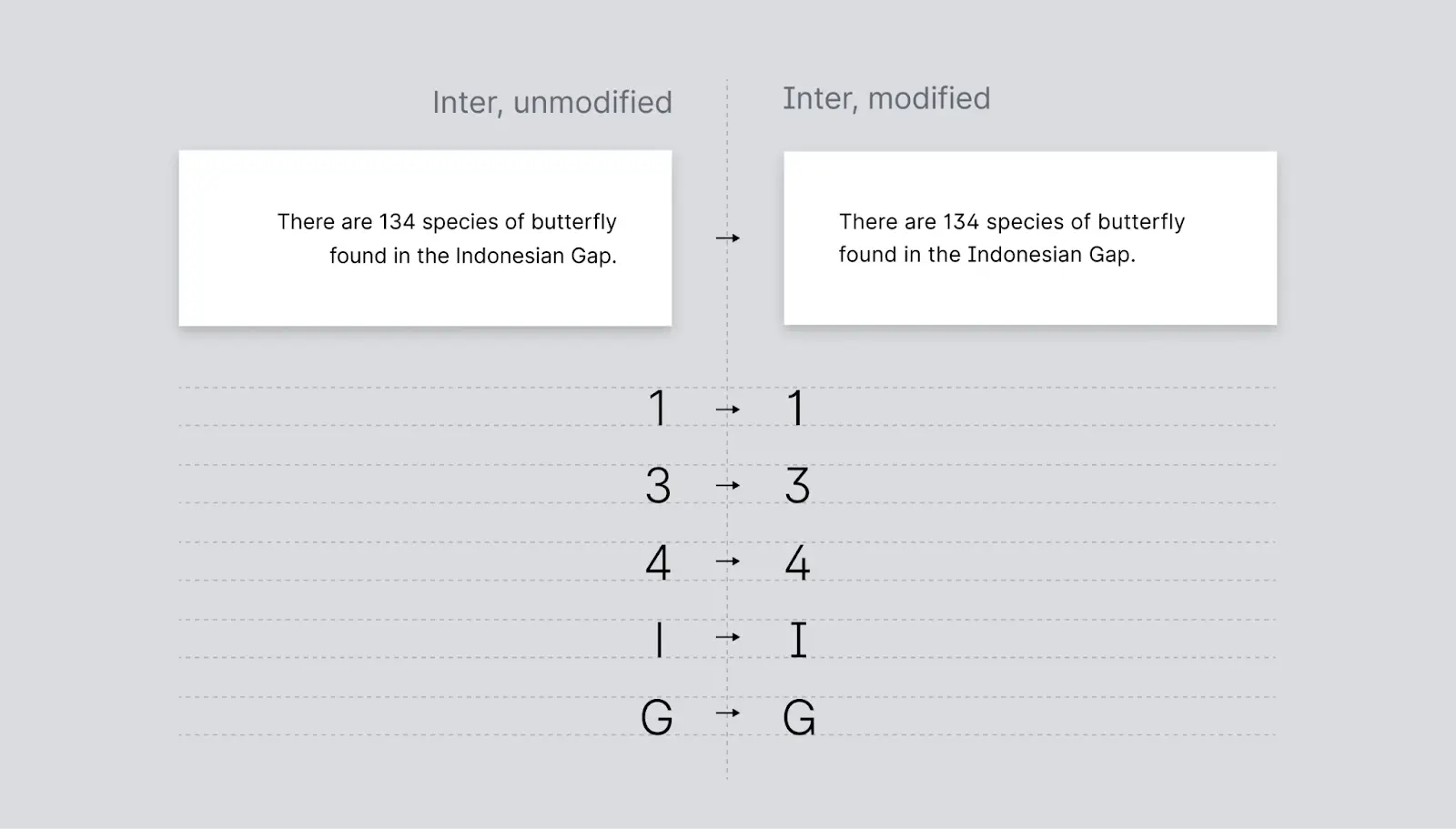
Inter font enhancements
Color enhancements
Our visual signature heavily relies on grays to indicate contrast, elevation and illumination among UI elements. Therefore, one of the most significant updates to our design system was replacing our previous neutral gray color palette with a new one consisting of cool grays. By adding some saturation and a hint of blue, our new palette of grays is now more vibrant and appealing.
Another update we made to our color palette was changing our link color from forest green to blue. Blue is a standard color for links that many internet users recognize, as it is strongly associated with clickability and is minimally affected by red and green color blindness. Additionally, switching to blue helped avoid confusion, as it was difficult to distinguish forest green links from the regular green text used in the UI to indicate success or gains.
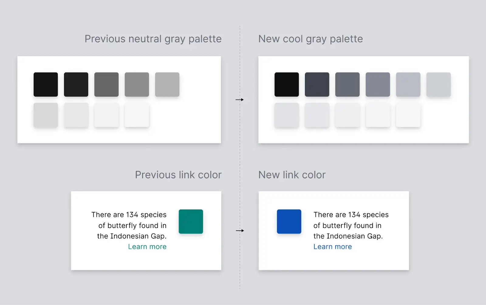
Color enhancements
Elevation system
In addition to the color and font enhancements, the essence of Addepar’s new visual signature is our new and improved elevation system, which is how we define and design for depth within our user interface.This system relies less on borders, and heavily leverages our gray palette to create depth and provide a richer, more immersive experience for our users.
Our elevation system was founded on the basic principles of how light behaves in the real world: objects closer to the light source appear brighter, while those farther away appear darker. In our new elevation system, we use "eu" (elevation units) to measure elevation. Similar to inches or degrees Fahrenheit, an “eu” is a metric we developed to help describe the height of a surface on the imaginary z-axis of the screen — the lower the eu the farther away it is from the user; the higher the eu the closer it is to the user and brighter. From a semantic standpoint, elevation indicates importance, so it was important for us to develop a system that places visual importance on the components with higher eu levels.
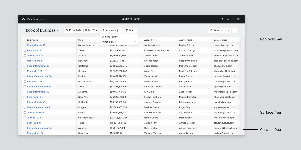
Put simply, our elevation system contains four basic planes:
Canvas: The foundation of every page starts with a canvas at 0 eu. Page headers and toolbars are typically the most common components found directly on the canvas.
Surface: Surfaces live on top of a canvas at 1 eu and will generally contain the most important and complex page functionality.
Debossed: Debossed areas are darkened areas that are sunken into a surface by 1eu On a surface, a debossed element is 0eu, and on a canvas, a debossed element is -1eu
Surfaces >1 eu: Any element greater than 1eu generally floats above the surface it is on and has a drop shadow to indicate its high elevation.
When you compare our new elevation system with that of our old design system, you’ll notice that the difference is striking. With just a simple system of grays, we create a whole world of depth and elevation, all without overwhelming the user with borders, gradients and excessive shadows. We use just tones of gray and a single shadow to achieve this effect.
Showcasing depth in our borderless elevation system
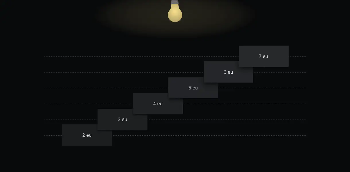
Another important aspect of our design system is our use of illumination in dark mode. In light mode, we use drop shadows to indicate elevations above 1 eu. However, in dark mode, drop shadows are insufficient because they blend into the already dark background. To address this, we developed a system for brightening surfaces based on their elevation in dark mode. Similar to how objects closer to the sun appear brighter in the real world, surfaces with higher elevation in our design are brighter.
Illumination in dark mode
Design tokens
A standout feature of our new design system is the use of color tokens to inform the colors of all our components. These color tokens are named to match their specific use. For instance, the canvas uses a color token called bg-canvas, paragraph text uses text-primary, and primary buttons use action-primary. These tokens are derived from primitives, which are raw colors defined by their hex values.
These color tokens are also defined in the codebase with the same names, allowing engineers to reference the same tokens used by designers in their design files, ensuring consistency between design and development.
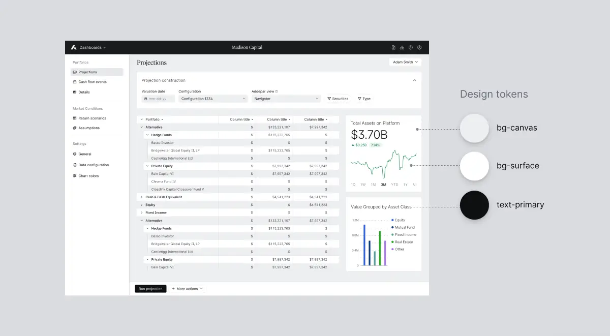
Design tokens used in our UI
Figma’s variables feature allows us to set up this system of color tokens so that we can ensure colors are consistently applied for similar purposes across components in the design system. More importantly, this system enables us to define colors for various modes.
For our initial launch of our design system, we will support a light mode and a dark mode. To achieve this, each color token will essentially reference two primitives: one for light mode and one for dark mode. At the flip of a switch, designers can now switch their designs from light to dark mode, provided they have assigned our color tokens to all their UI elements.
In the near future, we plan to leverage variables to also support various accessibility modes. We have already laid the groundwork for a high contrast mode in late 2024, and plan to support additional modes like protanopia (blindness to red) and deuteranopia (blindness to green) modes starting in 2025.
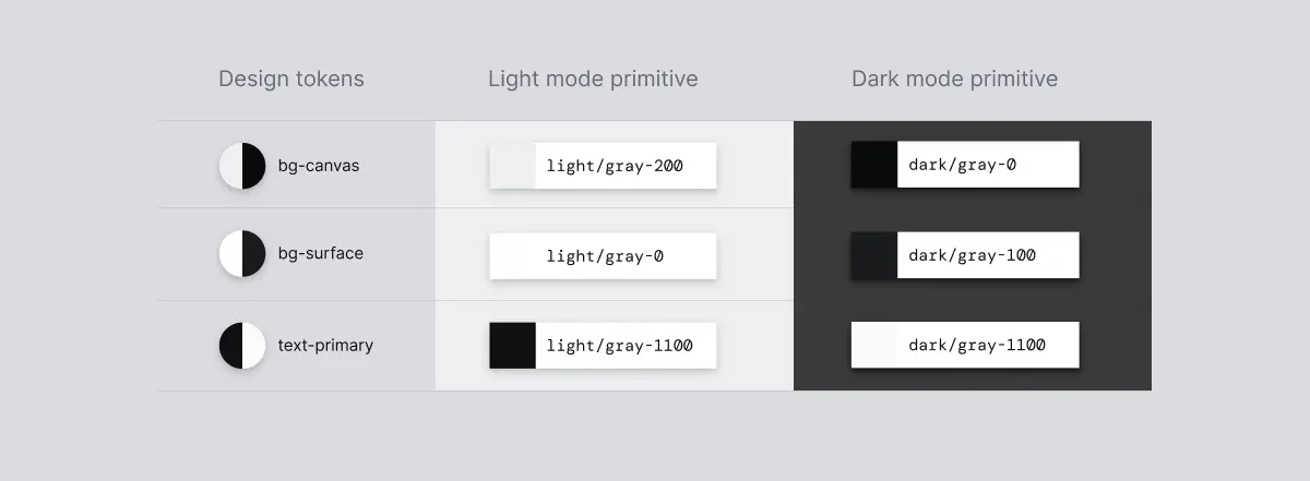
Light mode and dark mode colors defined for each design token
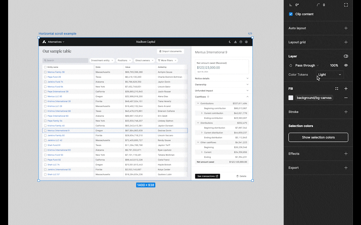
Switching between light and dark mode in Figma
Final thoughts
Defining Addepar’s visual signature was a cross-team effort encompassing user research, design, and implementation. Thank you to all our product, design, user research and engineering stakeholders who contributed to bringing our new look and feel to life. Special thanks to the executive team for their unwavering support throughout this redesign.
Perhaps the biggest challenge we faced in this project was figuring out how to create a visually beautiful design system without compromising on accessibility. Given our expanding global presence, it was essential to ensure our new design system caters to all users. For this to work, we will incorporate accessibility mode features into our user preferences in the future, so users can select a visual mode that best suits their needs.
You can experience our new visual signature now in our Dashboards product. Stay tuned as we continue rolling out the new design across all products.